
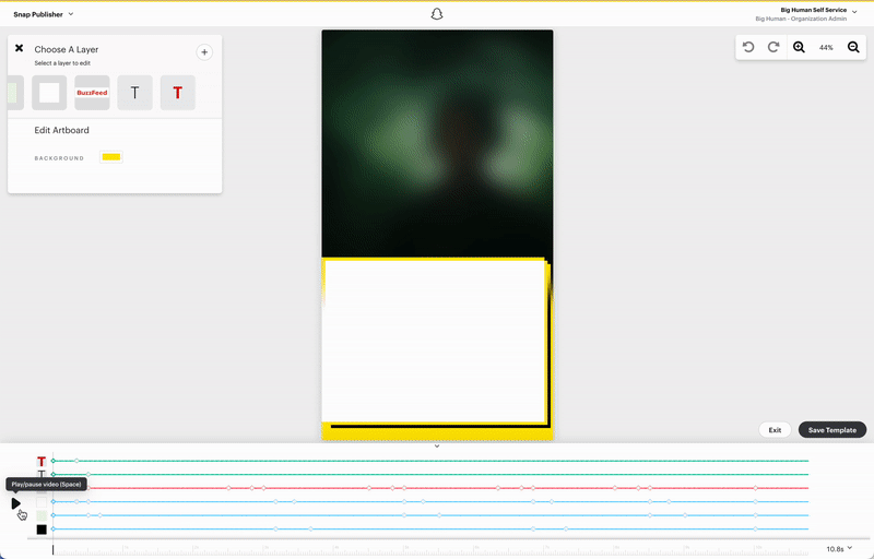
Snap
In the fiercely competitive market of social media platforms, Snap Inc. (formerly known as Snapchat) commissioned the design of 12 new news templates for the Snapchat Discover feed. These templates were intended to help news partners automate the fast-paced publishing workflow and keep up with the high demands of daily content production. While the request sounded straightforward, the real challenge was quickly learning Snap’s in-house publishing tool, Snap Publisher, in order to produce the templates efficiently.
Within a four-week sprint, a small team of three—a product manager, a design supervisor, and myself—rapidly familiarized ourselves with the system and ultimately delivered 23 polished news templates across 5 distinct visual directions. Each direction was designed to support different editorial styles while resonating with Snapchat’s young audience.
As a result, the project exceeded the original request and provided Snap’s partners with a flexible and scalable toolkit for content publishing.
Roles
- Competitive Landscape Research
- Moodboard
- UX/UI Design
- Animation
- Delivery using Snap Publisher

Existing Snaps
Our examination of the current Snapchat Discover feed had two objectives: to gain insights into the audience and the kinds of news content being consumed; and to identify any existing obstacles and pain points that were affecting Snap, its publishing partners, and its users. Based on our findings, we were able to provide accurate insights and solutions for the new templates we were creating.
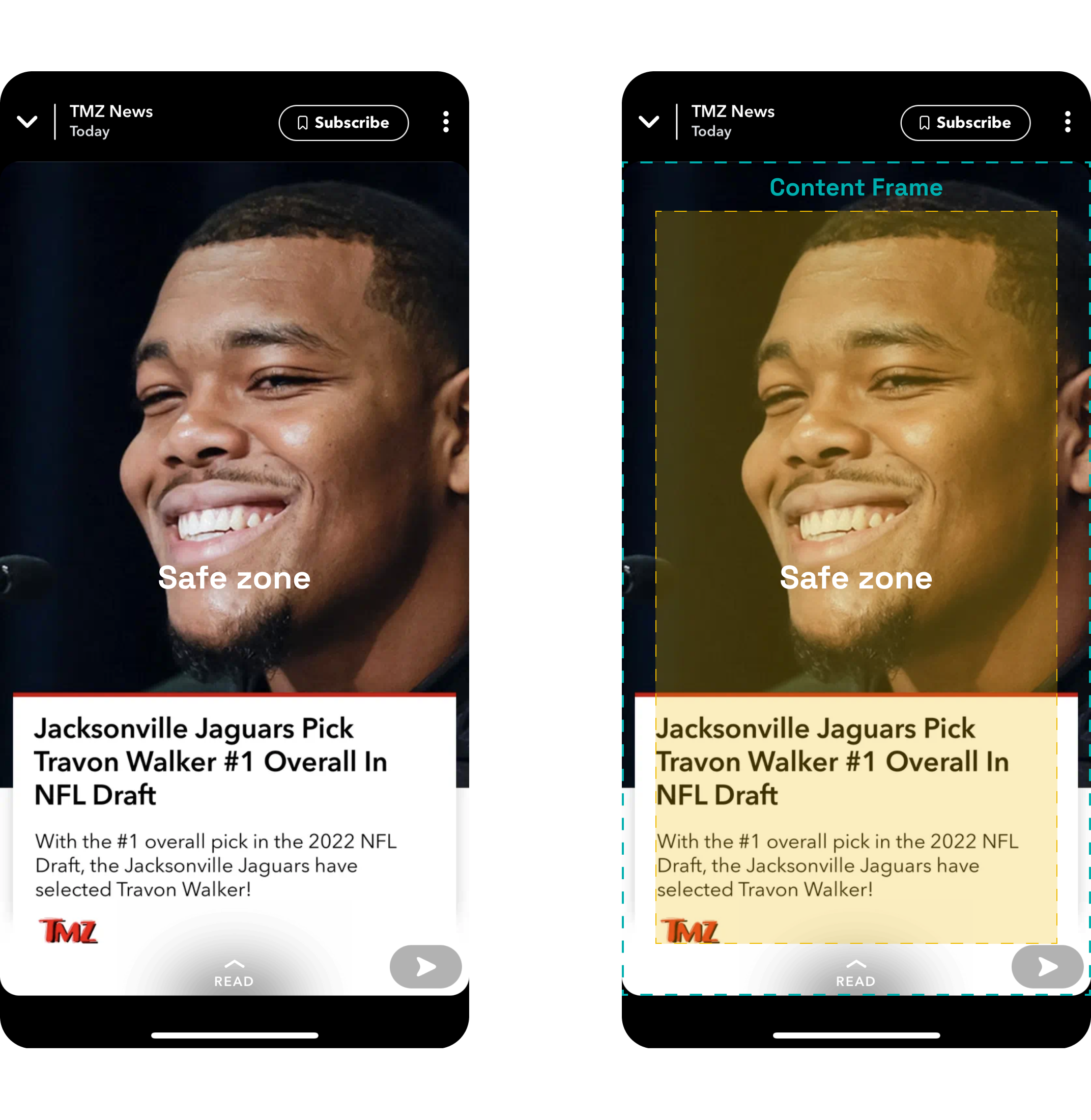
Image orientations
When it comes to images, there are usually three primary orientations: landscape, portrait, and square. Cropping these images for multiple media outlets and platforms can be a laborious task.
To simplify this process, we needed to create solutions that would be both efficient and foolproof. These solutions should preserve as much image and text content as possible, while also maintaining a visually appealing and legible format that would resonate with Snap's teenage and young adult viewers.
To simplify this process, we needed to create solutions that would be both efficient and foolproof. These solutions should preserve as much image and text content as possible, while also maintaining a visually appealing and legible format that would resonate with Snap's teenage and young adult viewers.
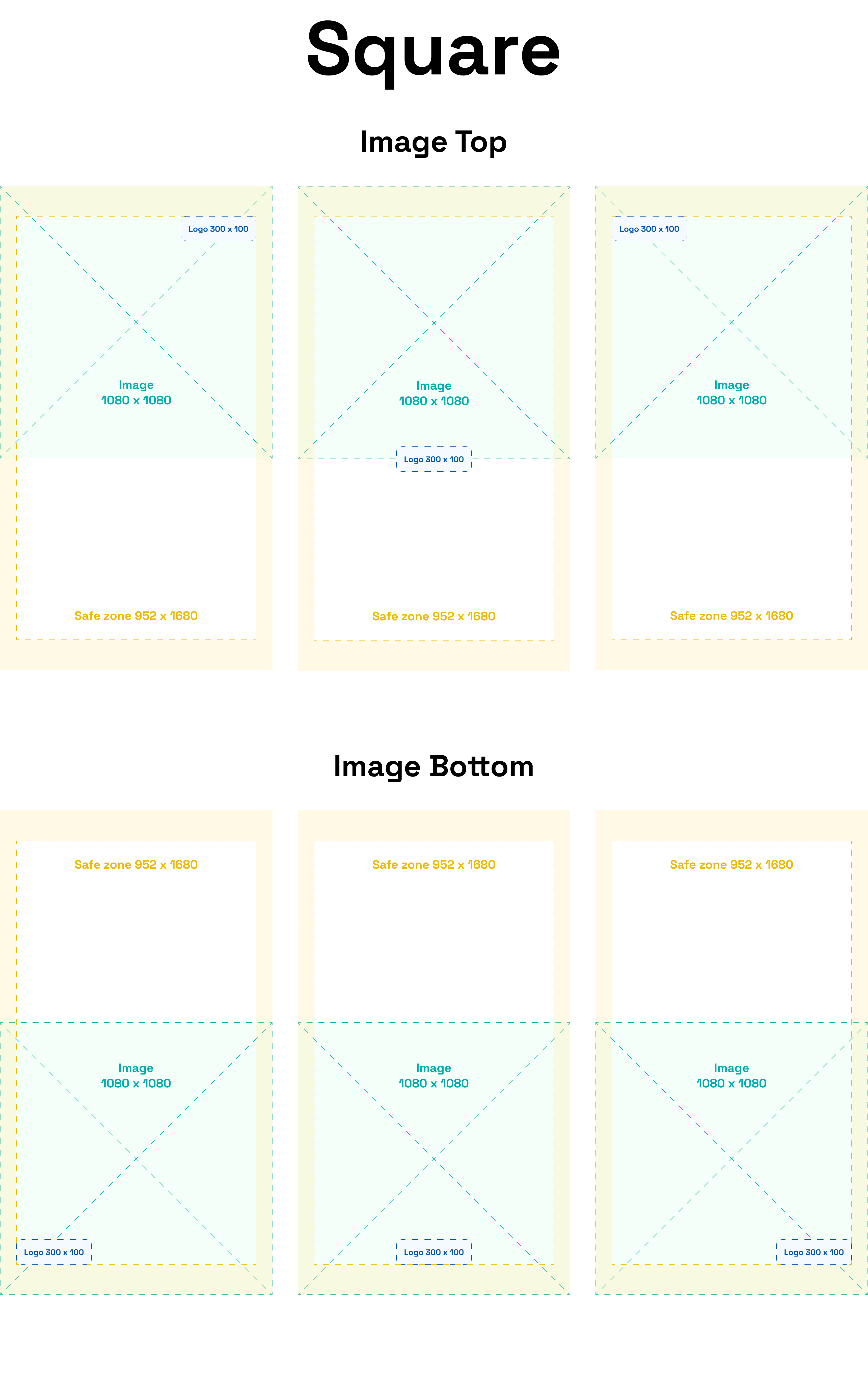
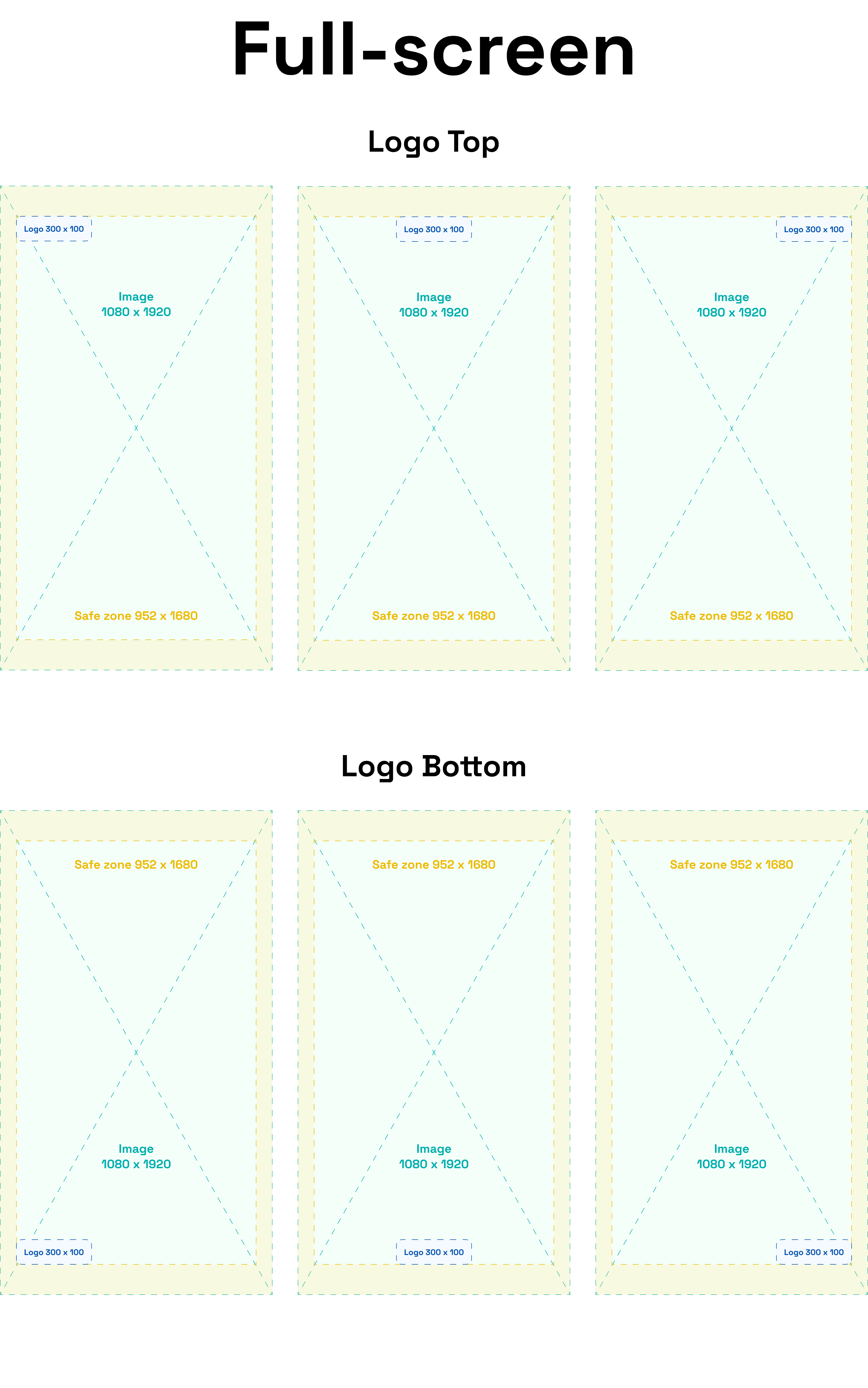
So we narrowed down the options to only square and portrait image ratios, as they meet right in the middle of all of our needs.
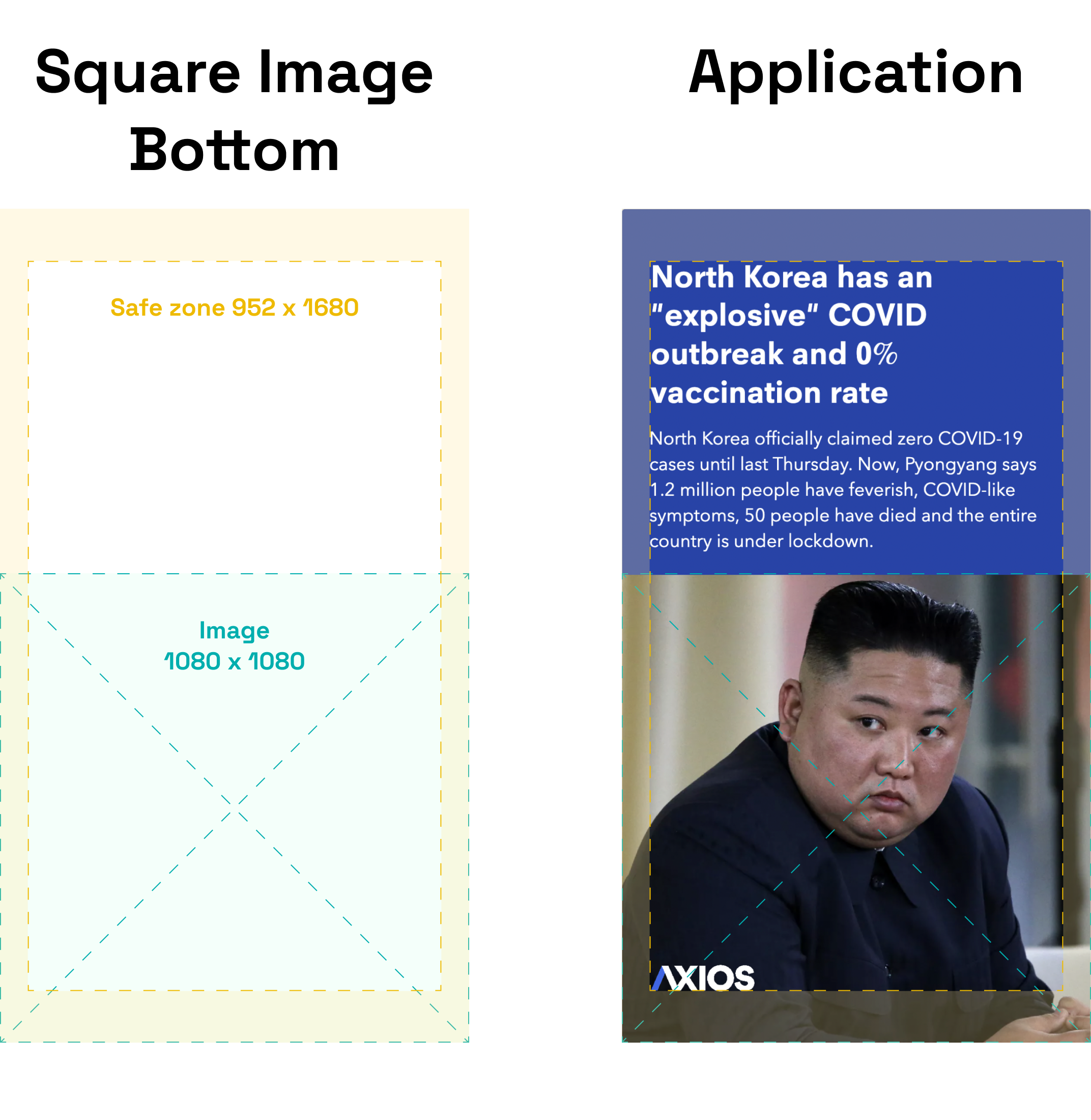
From there, we then set up the parameters for a few possible composition variables.
From there, we then set up the parameters for a few possible composition variables.

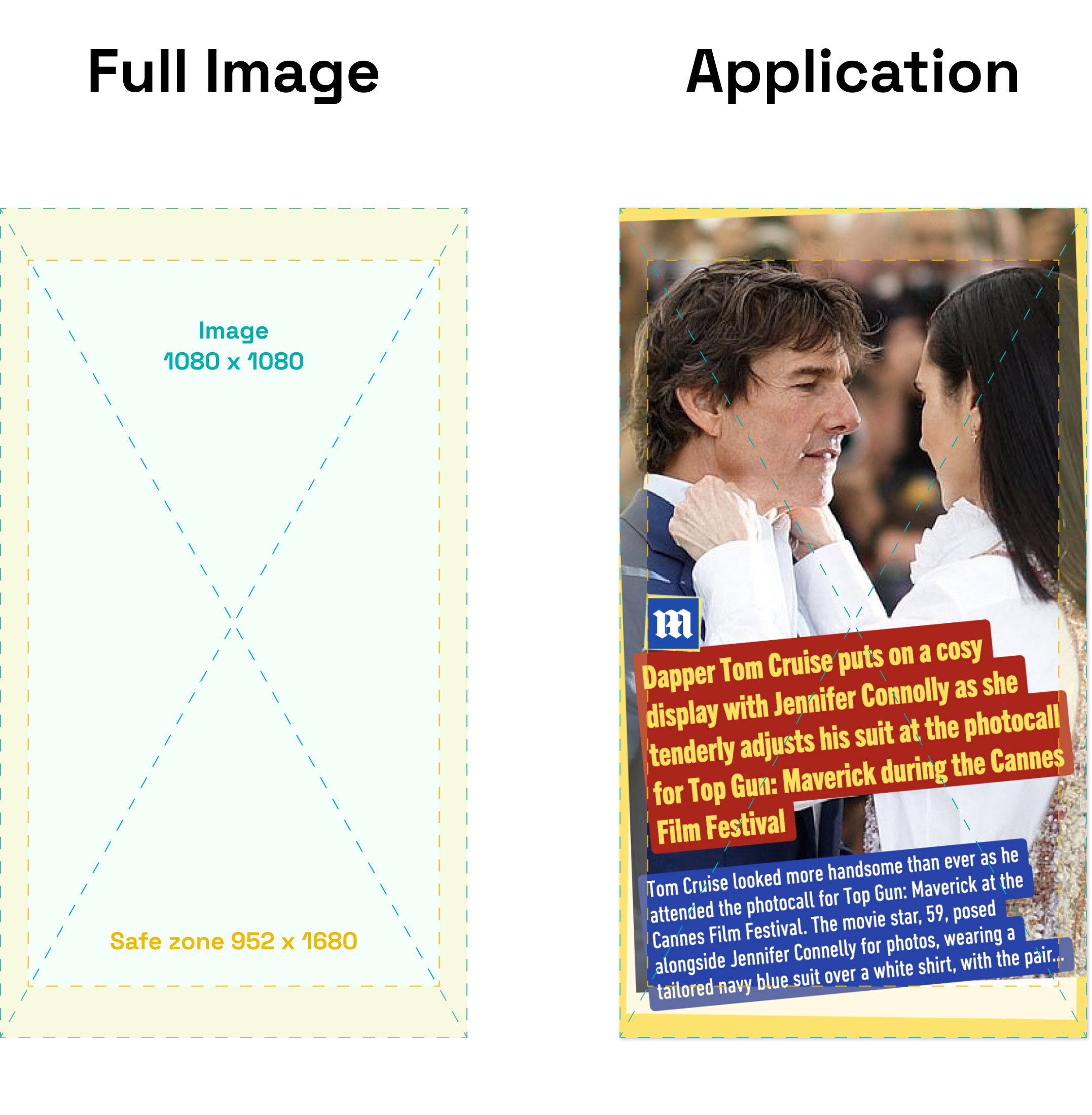
Taking into account our competitive landscape research in the early stage, we templatized some design applications, following the prior set of parameters, then refined them into 5 broad visual directions as follows.
Pop
colorful • energetic • layered & collage • texture & overlay
It was a no-brainer for us to adopt a bright and dynamic look with multiple elements in Snap's design, as it is what the company is recognized for, and it was the first visual direction that came to our mind during the design process. Taking BuzzFeed as an inspiration, in both visual & content, is perfect and ideal for Snapchat Discover feed. Them is relatively newer but definitely on the rise of popularity amongst teens & young adults so we added to the mix.
It was a no-brainer for us to adopt a bright and dynamic look with multiple elements in Snap's design, as it is what the company is recognized for, and it was the first visual direction that came to our mind during the design process. Taking BuzzFeed as an inspiration, in both visual & content, is perfect and ideal for Snapchat Discover feed. Them is relatively newer but definitely on the rise of popularity amongst teens & young adults so we added to the mix.

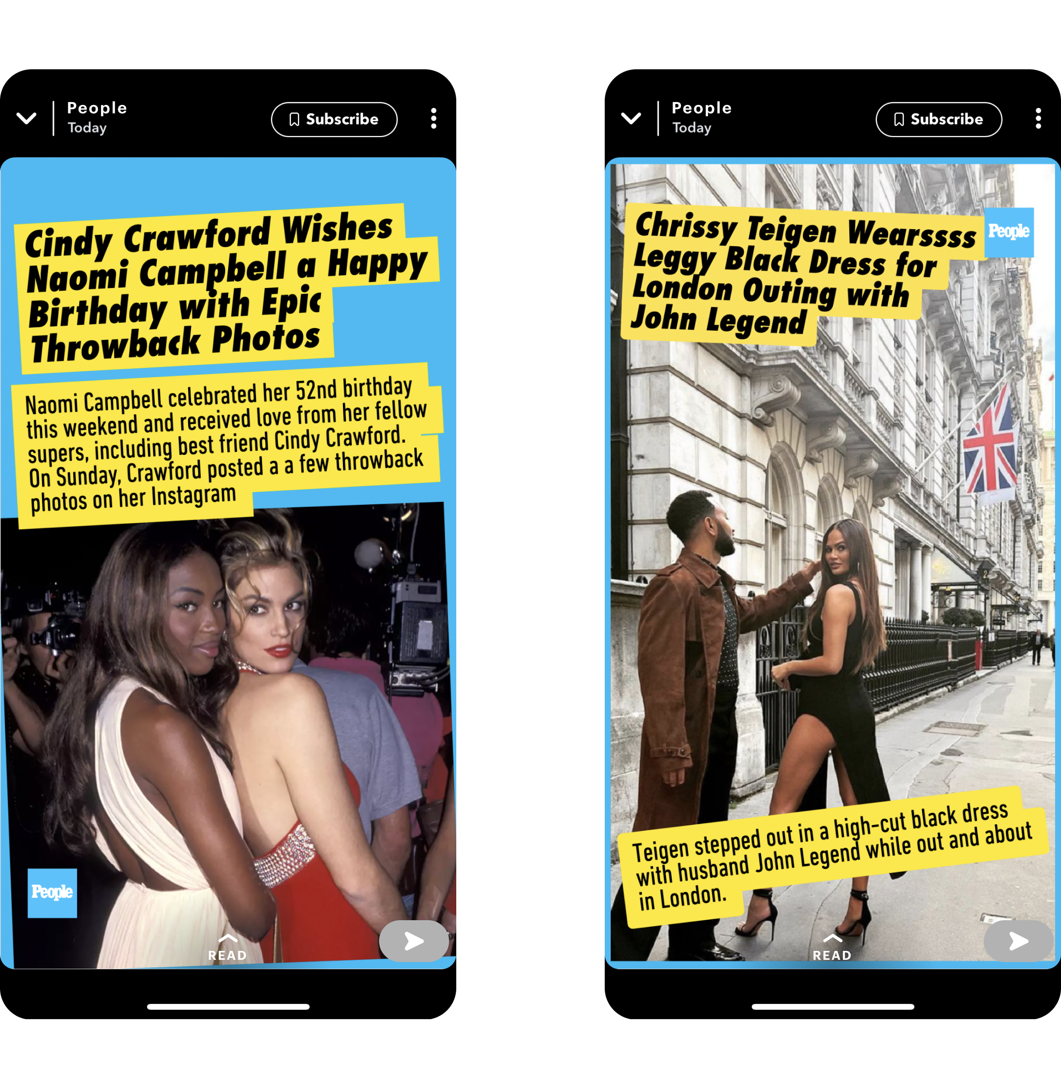
Celebrity
bold urgency • eye-catching • bright & loud
Another undeniable popular content on Snap is celebrity news, which often are loud, eye-catching and urgent. Every piece of information is meant to be boldly revealed and direct. News from Daily Mail and People are amongst the highest consumed content, and now also well-templatized, on Snap.
Another undeniable popular content on Snap is celebrity news, which often are loud, eye-catching and urgent. Every piece of information is meant to be boldly revealed and direct. News from Daily Mail and People are amongst the highest consumed content, and now also well-templatized, on Snap.

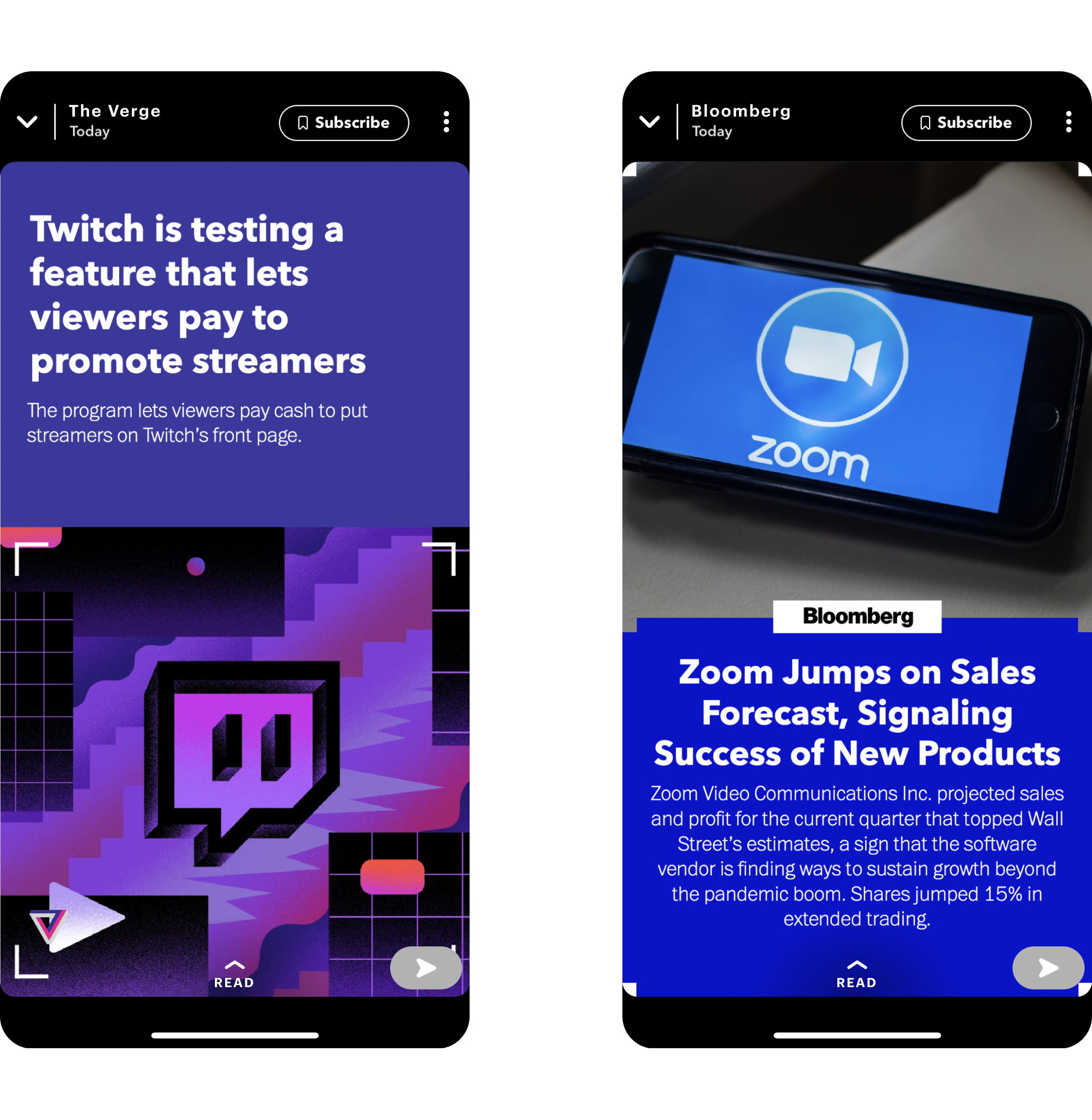
Techy & Minimal
clean & airy • straightforward • line & frame
Technology & media go hand-in-hand nowadays, not excluding on Snap. A minimal approach with cooler color tones, straight edges and corners has proven to be the most well-suited in the tech realm. It’s our take of the techy vibe, applied on The Verge, Bloomberg, and Axios content, for the increasingly younger and more tech-savy population on Snap.
Technology & media go hand-in-hand nowadays, not excluding on Snap. A minimal approach with cooler color tones, straight edges and corners has proven to be the most well-suited in the tech realm. It’s our take of the techy vibe, applied on The Verge, Bloomberg, and Axios content, for the increasingly younger and more tech-savy population on Snap.
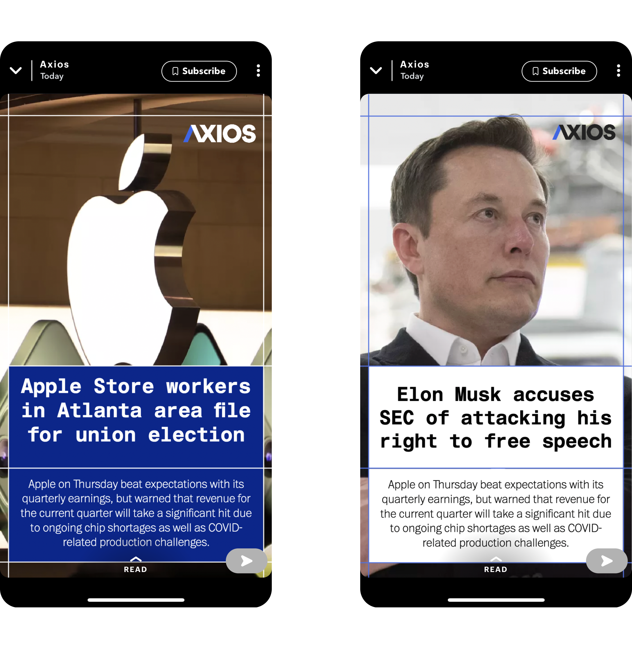
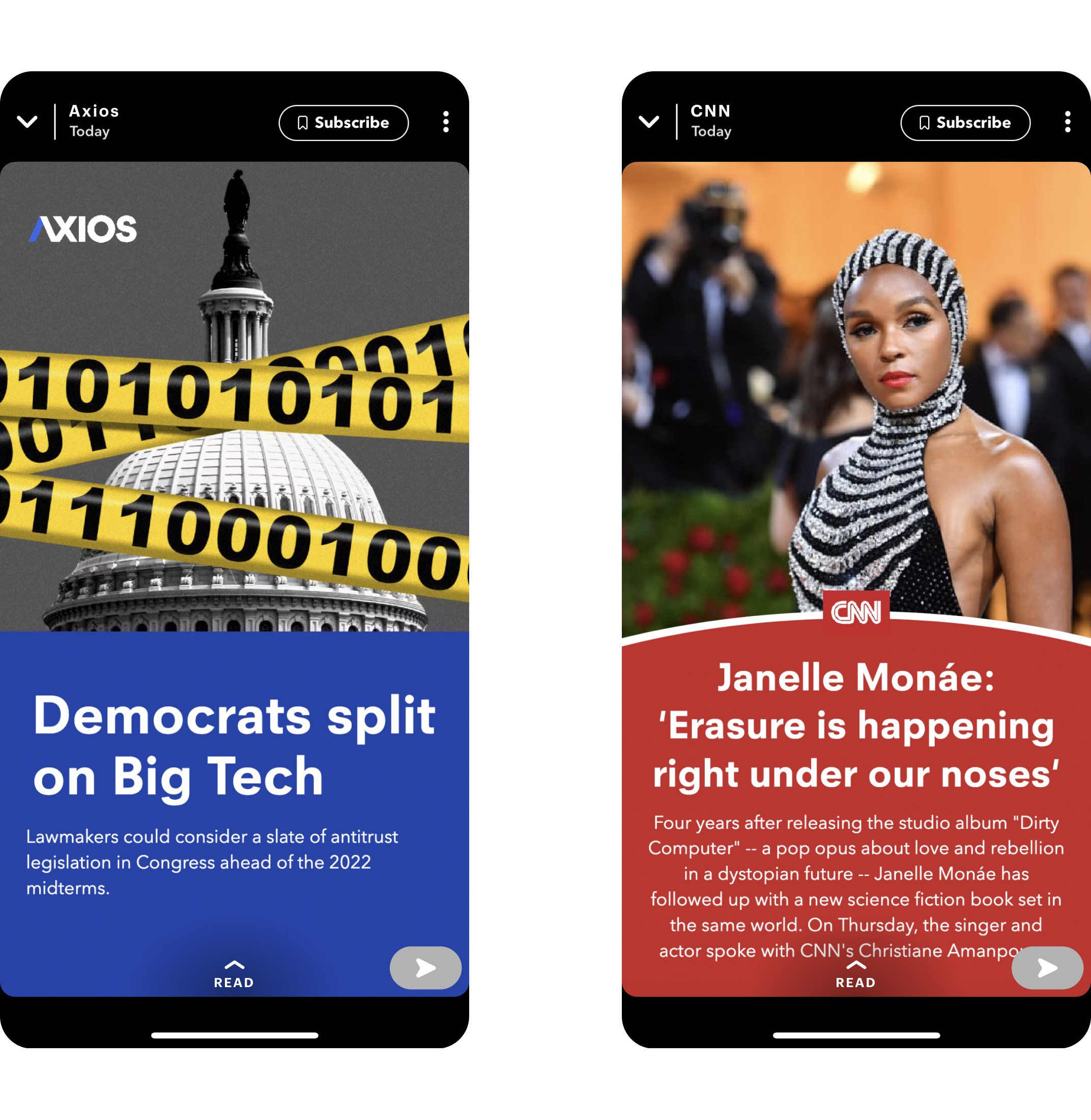
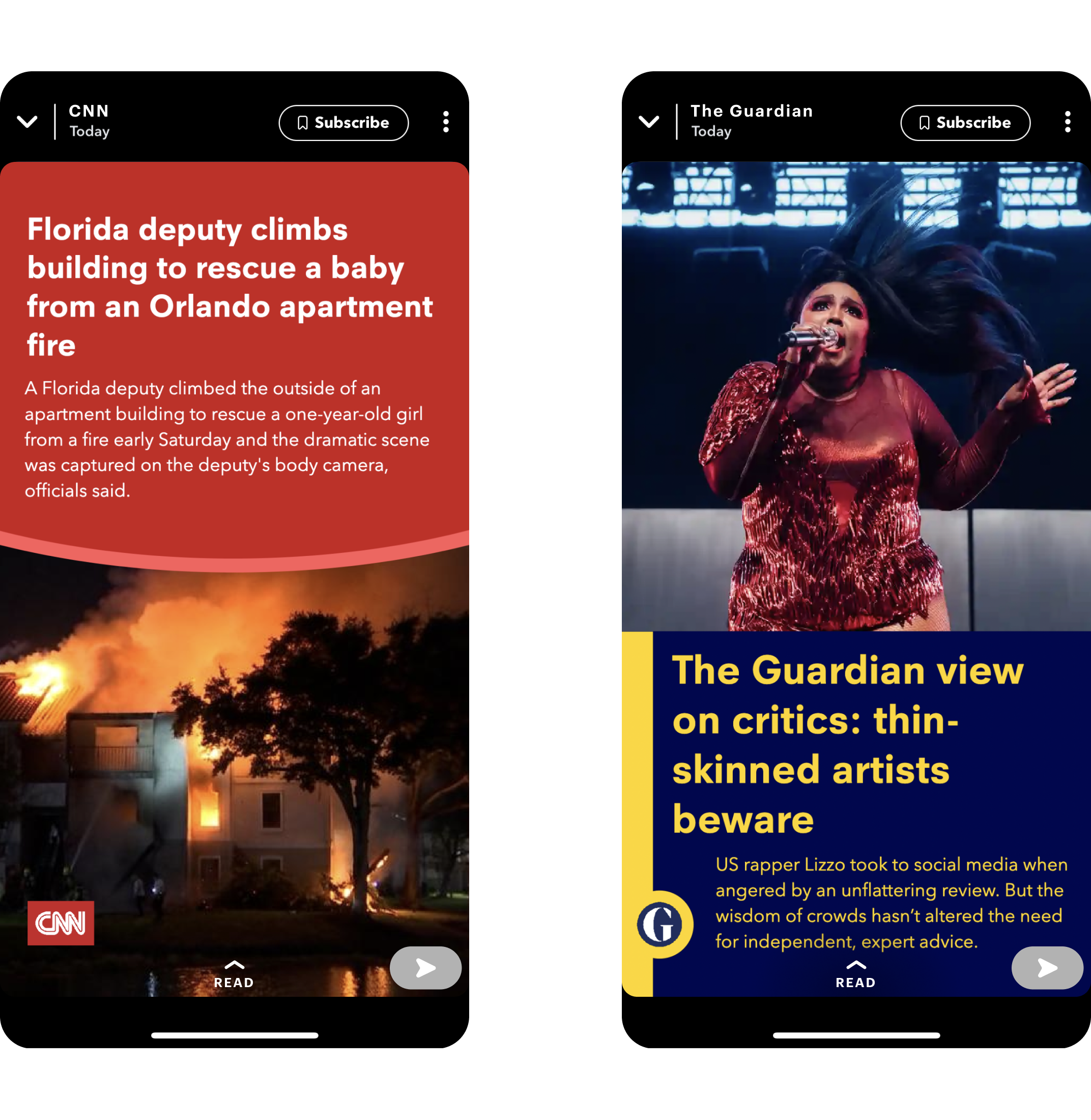
Bold
bold • modern typefaces • limited palettes
To be more compelling to gen Z Snap users, the Bold direction is meant to bring out a refreshed and contemporary look and feel, by utilizing sans-serif types and more bold colors while maintaining a certaint level of simplicity. This direction caters to news organizations like CNN, The Guardian, and Axios, to name a few.
To be more compelling to gen Z Snap users, the Bold direction is meant to bring out a refreshed and contemporary look and feel, by utilizing sans-serif types and more bold colors while maintaining a certaint level of simplicity. This direction caters to news organizations like CNN, The Guardian, and Axios, to name a few.
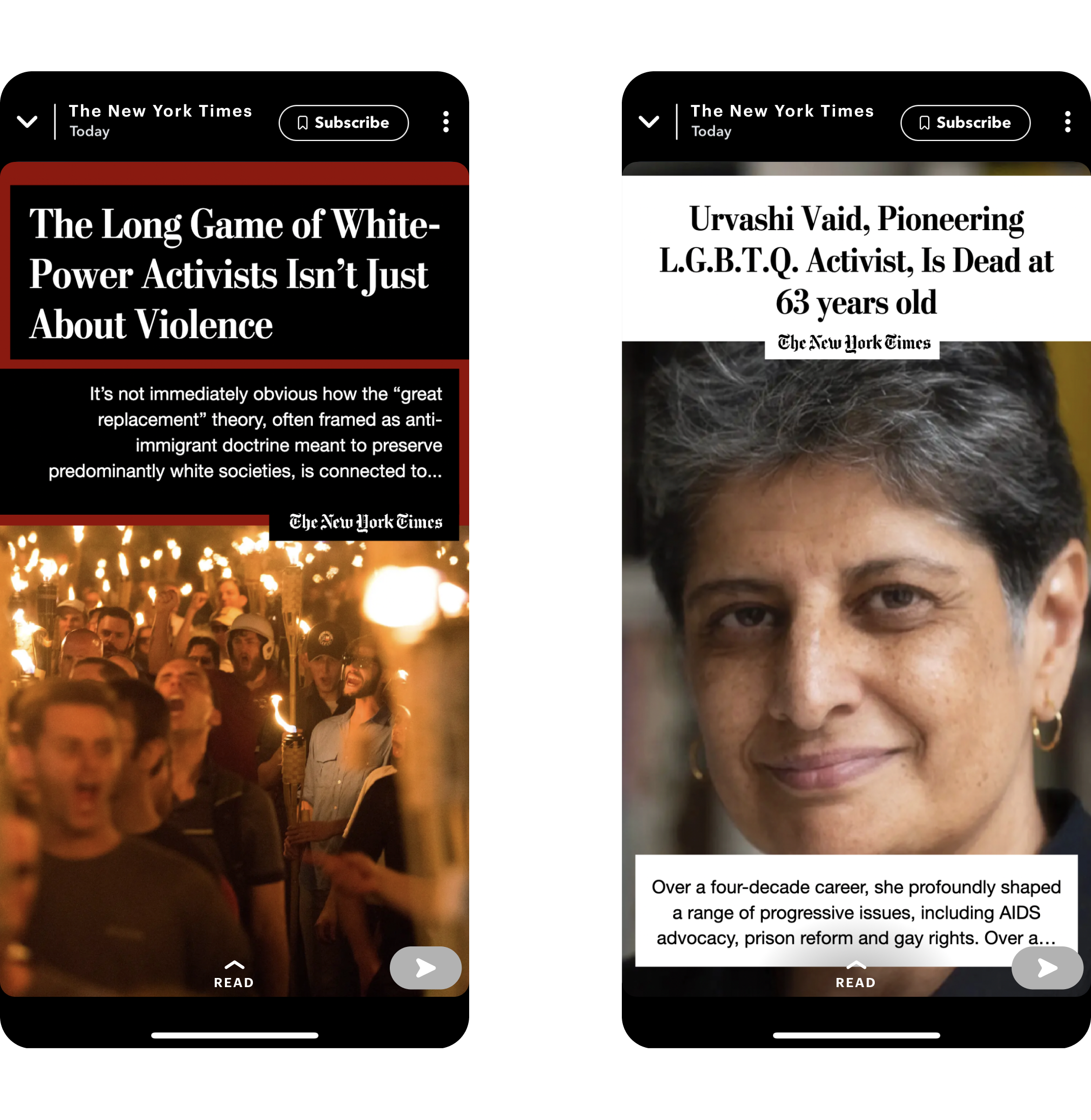
Classic
clean & refined • serif fonts • content first
Lastly, a classic look using mostly black & white, an accent color, and serif typefaces, for the traditional & long-standing news publishers such as The New York Times and The Washington Post. Even though they might not be as popular on Snap as the others we mentioned, but still deserve a spot since Snap Publisher offers many serif fonts.
Lastly, a classic look using mostly black & white, an accent color, and serif typefaces, for the traditional & long-standing news publishers such as The New York Times and The Washington Post. Even though they might not be as popular on Snap as the others we mentioned, but still deserve a spot since Snap Publisher offers many serif fonts.

Deliverables
It wouldn’t be as much of a challenge, as well as the fun, if it wasn’t to rapidly learn, fully understand, and timely deliver using Snap Publisher by working directly with Snap product team.
At the end, we exceeded the expectation — over delivered 23 Snap templates, almost double from the intital request of 12; plus, annotation documented settings for each template; plus, landing & engaging animation — too many cherries on top?
At the end, we exceeded the expectation — over delivered 23 Snap templates, almost double from the intital request of 12; plus, annotation documented settings for each template; plus, landing & engaging animation — too many cherries on top?


We were happy that we got the most out of Snap Publisher tool, and hope that Snap team, their partners and users got the most out of the 23 templates we crafted as well.
The 4 weeks ran out fast, but just at the right time. That summed up our engagement — although not the first, and hopefully not the last either :)
more work